DOT Tracking Analytics
On this page
Introduction
DOT Tracking Analytics provides a comprehensive look at the data gathered by a vehicle's CAN bus. This data is extremely powerful for getting a measure of how efficiently your vehicles are being used and for identifying areas for improvement - both leading to cost and fuel savings.
All the metrics in Analytics converge on the Grading where a score is given based on both negative and positive driving behaviour. The effect these metrics have on the score can be customised to fit in with company driving practices.
Overview
The Analytics page consists of a sub-menu, an options panel and the content area for displaying the data. The sub-menu on the left side are links to each Analytics page. The options panel beneath allows you to set a number of criteria and these will be persisted from page-to-page.
Options Panel
Segment
It is possible to group the Analytics by a number of segments:
- Vehicles
- Drivers (for Tachomaster users)
- Sites
- Fleet Types
- Vehicle Groups
- Vehicle Makes
- Vehicle Models
- Vehicle Types
Some filters in the options panel may not be available for some segments.
Label
When the Vehicles segment is selected it's possible to change the label displayed in the content area to either the vehicle registration or the Fleet Number.
Date Range and Filters
The Date Range and Filters effect what data is selected to be displayed. Once saved these filters will persist between all the different Analytics pages.
Other Options
Other options will appear at the bottom of the options panel depending on what page is being displayed. The Grading page allows the entering of a minimum distance, hiding all those that have not done at least that number. The Idle Time page allows you to set a threshold where those below it will be highlighted in red. Other pages may have other options too.
Dashboard
Firstly, navigate to the Falcon Analytics screen:
- Access Analytics through the menu item on the Falcon main menu
The Analytics Dashboard brings together all the metrics available. The top most graph displays the metrics across the entire fleet:
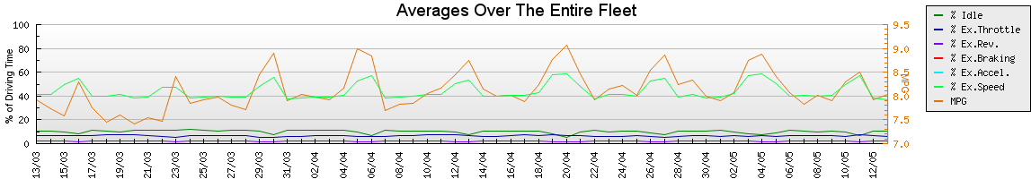
Metrics are displayed seperately below showing just the first 6 vehicles in each section. You can click on each of these to navigate to the full section for that metric.
Below the metrics is the lowest 5 scoring vehicles in the Analytics Grading. We will look further in to Grading below.
Grading
The Grading screen is based on valuing good driving behaviour and scores drivers and vehicles accordingly. A final score based on all available metrics is used to compare vehicles and drivers (when available). Every subject (a vehicle or a driver) starts with a score of 100, with each metric they will be deducted a given number of points (configurable in the Configure Points screen) depending on their behaviour. The only exceptions are Cruise Control and Fuel Consumption, where points can be awarded to the subject.
See a screenshot of the Grading table below:
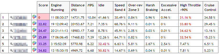
See below for the definitions of each metric column:
| Column | Description |
|---|---|
| Score | Overall score based on values of other metrics. |
| Engine Running | Plain and simple, the total time that the engine was running. |
| Distance | The total distance covered by the subject. The distance unit can be configured in the Settings. |
| Fuel Consumption (l/100km or MPG) | The fuel consumption for the current period. The consumption unit can be configured in the Settings. |
| Idle | The Idle time is calculated by deducting the detected motion time of the vehicle from the total engine on time. The percentage figure shown is the percentage of the total engine running time that was spent idling. |
| Speed Band 4 | The speed for a vehicle is stored in 4 bands, 1 being the slowest and 4 being the highest. This column displays the percentage of engine running time where the vehicle was in the highest speed band (4). The actual speed for this band may differ by the device fitted to the vehicle, contact DOT Tracking Support for more information. |
| Over-rev | Engine revolutions are stored in 3 zones (Zone 1: 300RPM to 1000RPM, Zone 2: 1000RPM to 1600RPM, Zone 3: > 1600RPM). The Over-rev column shows the percentage of engine running time the subject spent in the highest zone. |
| Harsh Braking | Braking is stored in 3 bands, the 2 lowest bands holding the highest deceleration data. The Harsh Braking column shows the 2 lowest bands combined as a percentage of engine running time. |
| Excessive Acceleration | Acceleration data is stored in 3 bands, the highest 2 bands containing the highest acceleration data. The Excessive Acceleration column combines the top 2 bands and shows the percentage of engine running time spent in those bands. |
| High Throttle | Throttle Pedal position is stored in 4 bands (0% to 20%, 20% to 50%, 50% to 90% and greater than 90%). The High Throttle column displays the percentage of engine running time spent in the 90% throttle zone. |
| Cruise Control | The Cruise Control column displays the percentage of engine running time spent with Cruise Control on. |
To view the actual effect each of the values in the Gradings table have made it's possible to view the duration and points for each value. Below the Gradings table to the left is a  button. On clicking this button each cell in the table will be populated with 2 extra pieces of information:
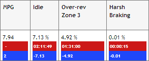
The red value is the total duration of that metric, the blue value is the points value that will be applied to the current score (starting at 100). In the example above the end result would be:
100 + 2 - 7.13 - 4.92 - 0.01 = 89.94
The serverity of each metric can be configured, see below.
Grading Configuration
The Grading Configuration can be navigated to from the Grading screen and the  button at the bottom of the Grading Table.
From this screen you can configure the number of points that are awarded or taken away in the Grading table. Points are applied to the percentage of driving time for each action; for example if a driver has idled for 10% of the driving time and 2 points are assigned to the idle value below, the driver will have 20 points deducted from a starting score of 100.
Each of the metrics are represented on the configuration page. The first section is dedicated to negative actions, those that will deduct points. For example:
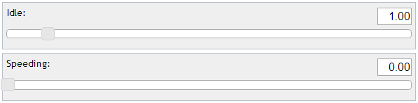
In this example, Idle is set to multiply the percentage of driving time spent idling by 1. Speeding in this example has been set to zero and will not effect the Grading score at all.
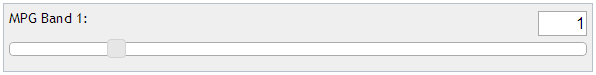
The next section focuses on MPG bands and what effect they will have on the score.
Each MPG band will reward a fixed number of points if the subject is in that band. See the screenshot below for an example configuration:
The next section is the setting for Cruise Control. This works in a similar way to the negative actions above, but instead of multiplying the percentage of driving time and deducting it, the value will be added to the score - promoting good driving style.
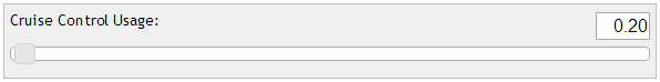
With this example for every 10% of driving time where cruise control was in use, 2 points will be added to the total score.
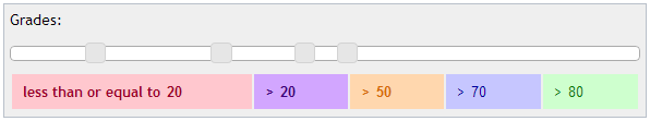
Lastly is a display setting. You will have noticed on the Grading table different scores are shown in a different colour. The bands for these colours are set here, simply adjust the sliders to set the score at each colour:
Metric Pages
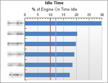
There are up to 8 metric panels each displaying a specific set of data:
- Average Fuel
- Idle Time
- Throttle Usage
- Engine Revolutions
- Acceleration / Braking
- Speed (including Cruise Control)
- PTO Usage (may not be displayed if no PTO enabled vehicles exist)
- Engine Use
Each of these pages follow the same page layout. See an example below for Average Fuel:
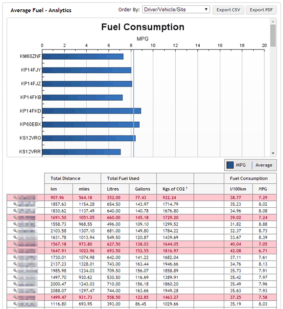
Along the top of this page is an options panel:

From this panel you can sort the data by different values and export to CSV or PDF files.
The page has a graph and a data table. Both will vary depending on the metric being viewed.
The data table allows you to drilldown in to the vehicles. On each row there is a magnifying glass  .
.
- Click the beside a vehicle.
This will open a new table showing the data broken down by date:
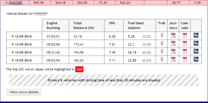
From here you can see the statistics for each day separately. There are links from here to navigate to the Trail for that day, the Journeys, the Calendar and if you are a Tachomaster user, you can navigate to the Vehicle Day View.
Another magnifying glass is displayed next to the dates on this table.
- Click the beside a date.
Another drilldown section opens below the date row. A chart is displayed at the top of this section, see the example below:
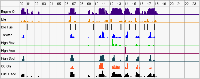
This chart displays the metrics in approximately 5 minute increments. Using this it's possible to identify when and where any negative driving behaviour may have taken place.
Below the chart is a new table, this time we are looking at the breakdown of statistics in half hour increments. The top 20% worst values are highlighted in red with the worst timespan being a deep red, and the better use of Cruise Control is highlited in gradients of blue (with the deepest blue being the best use).
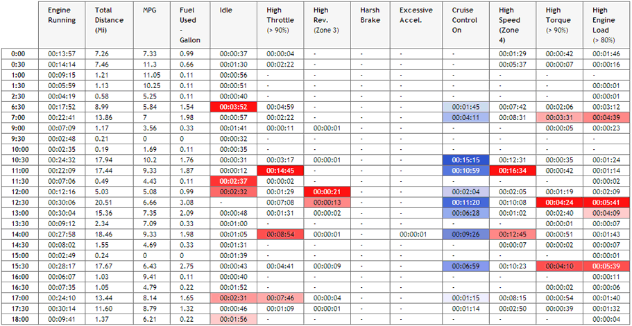
Again from here it's possible to navigate to a Trail to see where the vehicle was at that time.
To close any of the drilldown views simply click the magnifying glass again.