DOT Tracking Dashboard
On this page
Introduction
When you first log in to DOT Tracking you will be presented with the Dashboard. This collection of cards gives an overview of your fleet's performance, location and recent events. There are various shortcuts and functions that you can use on the dashboard. We will go over each card below.
The Dashboard automatically refreshes every minute to keep the data current. It is possible to pause this refresh by clicking on the pause button in the top right corner of each card.
Fleet Summary
The Fleet Summary card is designed to give you a general overview of how your fleet is being utilised over time. Look at the screenshot below:
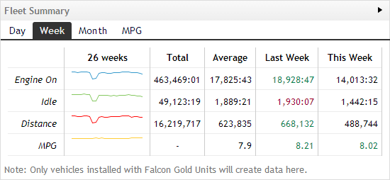
In this screenshot 4 metrics are shown on 4 rows; Engine On, Idle, Distance and MPG (fuel consumption). For each row there is a small chart depicting each metric's value over the last 26 weeks. Following this is the Total for the 26 weeks, the average per week, the total for the previous week, and the progress up to the current day of the current week.
Values highlighted in green are improvements over the average, anything highlighted in red are showing worse performance than the average - as seen in the Last Week for Idle above.
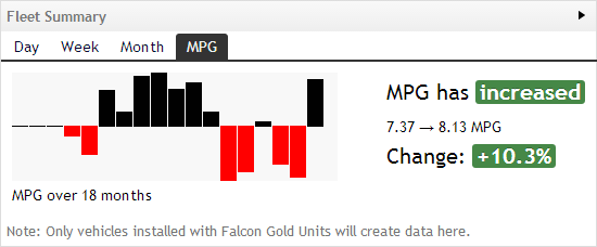
By default, the Week tab is selected. Selecting Day or Month will provide the same metrics, but over their respective time period. The MPG tab shows much more specific information about fuel consumption over the last 18 months and a notice as to whether the consumption has improved or not.
Live Overview
The Live Overview card displays counts of all vehicles seen today. The card breaks the totals down by those in use, and of those which are idling or moving, and those with their ignition switched off. Using this you can quickly see what portion of your fleet is in use and being utilised.
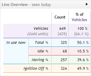
From here you can drill down and see what vehicles are in each section. Clicking the magnifying glass ( ) beside Idle will bring up a popup of those vehicles currently idling:
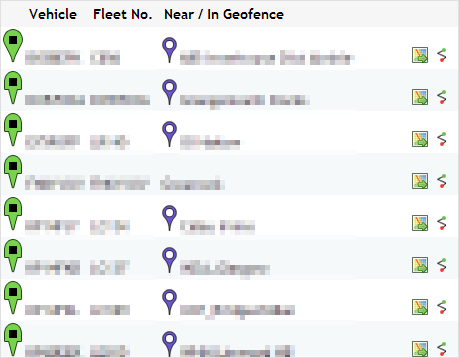
This window displays all the vehicles in the section clicked as well as a description of their current location. If the vehicle is in a geofence this pin is displayed  along with the geofence name. Clicking the
  icon will take you directly to that vehicle on the Latest Positions screen. Alternatively, clicking the
  icon will take you to that vehicle's Trail where you can view it's historical positions.
Recent Events
Various events occur in DOT Tracking, including Geofence entries and exits, movement outside of a set curfew time and silent alarms. The Recent Events card on the Dashboard provides a quick view of the most recent events. Look at the screenshot below:
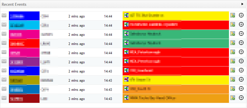
The screenshot above shows a full list of geofence events identified by the  icon. The display shows the vehicle registration, fleet number, time since the event occured, exact time of the event and the name of the geofence accompanied by one of two icons; the Geofence Entry
  and the Geofence Exit
  .
.
Clicking the  icon will display a popup map showing the GPS location of the event. Clicking the
  icon will locate the position of the vehicle as it is now.
Current Geofence Status
When geofences have been properly set-up the Current Geofence Status displays a count of vehicles in each geofence and geofence category. The initial screen displays the geofences grouped by geofence category:
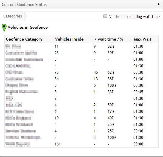
The above displays the Category, a count of vehicles in the geofences, a count of those exceeding any specified wait time (a wait time may be specified on a geofence or a geofence category) and the wait time set. If you wish, you may check the 'Vehicles exceeding wait time' to filter out any vehicles that have not exceeded their wait time.
Click on a geofence category and a list of geofences will be displayed in a similar style. Click then on to a geofence to display a list of vehicles inside that geofence:
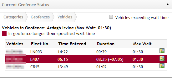
In this view it's possible to identify the vehicles exceeding their given wait time - they are highlighted.
